Der OTTO Store hat auch international einige Aufmerksamkeit bekommen. So schreibt Impersonation Failure:
A showcase of what’s possible today using .NET 3.0 is the new OTTO Store that went live earlier this month. […] Despite the slick WPF user experience the site is also one of the first to utilize managed Infocards to support the provisioning experience. Otto customers can associate their account with a Otto managed card backed with the self issued card of their choice.
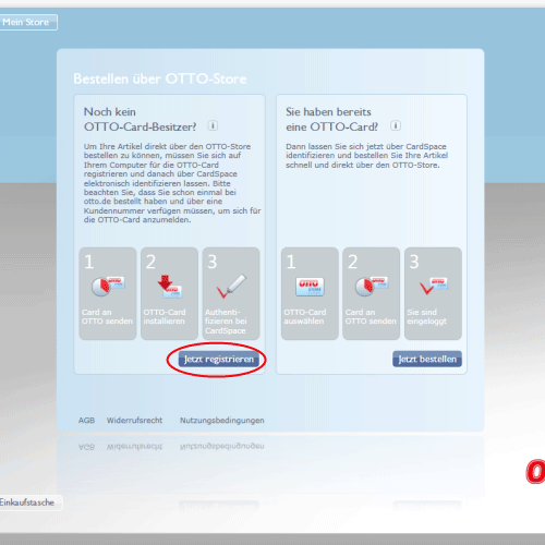
Mehr zu den Details der Cardspace Experience hat Vittorio Bertocci.
Tim Sneath („Musings of a Windows Vista Technical Evangelist“) schreibt über die virtuelle Umkleidekabine „Mix & Match“:
What makes this application really stand out from anything you could easily do on the web is that if you like a couple of products but want to see how they go together, you can drag them to a „mix and match“ icon on the bottom of the screen, and then you can dress a model with the items and see whether they go together in ensemble. I think even my daughter is going to enjoy this – it’s the online equivalent of „dress up Barbie“, even if that’s not quite what they intended.
Microsoft-Ingenieur Nigel Parker hat eine interessante Interpretation der strategischen Bedeutung des Projekts:
If you’ve read ‚the long tail‘ you’ll realise what Otto are doing here. They are using a smarter UI to make their catalog more accessible to their customers so that they can sell their products further down the tail thus creating a competitive advantage in a world where shelf space isn’t limited and your preferences can be visually served up front and centre.